TL;DR
I use pandas’ interface to the matplotlib library to create bar charts that visualize the manufacturing growth dynamics of European countries.
Long Description
I read in the dataframe that contains the slope and intercept parameter values from the linear regression with scikit-learn that I performed in the last project. Using the plot method of pandas that is linked to the matplotlib package, I create various bar graphs with an increasing amount of customization. The last, ordered plot is the basis for the interpretation of the data in the following project.
Table of contents
Project Background
Having data is one thing, bringing it into human-friendly form to provide an intuative understanding is another. Typically, this is done by visualizing the data with plots.
In the case of the EU manufacturing industry production time series, I have captured the growth dynamics for each country in the slope parameter of a linear fit. Here, I will visualize the slope with bar charts.
Loading the data
I start by reading in the slopes that I obtained from linear regression and which are stored in a pickled file:
import pandas as pd
df = pd.read_pickle('EU_industry_production_slopes.pkl')
df.info()
print(df.head())
<class 'pandas.core.frame.DataFrame'>
Index: 34 entries, AT to UK
Data columns (total 3 columns):
intercept    34 non-null float64
slope        34 non-null float64
slope_alt    34 non-null float64
dtypes: float64(3)
memory usage: 1.1+ KB

              intercept     slope  slope_alt
country_code
AT             0.979511  0.016976   0.015406
BE             0.935067  0.022740   0.020389
BG             1.001175  0.023327   0.028590
CY             0.906360 -0.027304  -0.018144
CZ             0.984347  0.030179   0.031784
slope and intercept come from a linear regression of the normalized EU (manufacturing) production index time series for each country. The slope_alt parameter is an alternative measure of the slope that I obtained by subtracting the production index values at the beginning of the time series from the values at the end of the time series, and dividing by the time span (17 years).
Visualization with bar charts
A basic plot
Let’s see how the growth dynamics of the different countries’ manufacturing production index, as measured by the slope parameter of the linear regression, compare.
Since the data is one-dimensional, with float values for the slope and discrete categorical values for the country code, a bar chart is a good plot type for visualization.
With pandas dataframes, a bar chart is simply created by loading matplotlib, calling the plot() method with the kind='bar' keyword argument, followed by the usual show() command to draw the figure:
import matplotlib.pyplot as plt

df.plot(kind='bar')
plt.show()
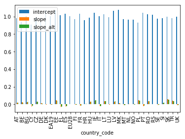
As we can see, by default all numerical columns are plot simultaneously, sharing one y axis. The x axis shows the country codes (reminder: here is a table that relates the codes to the actual country names).
Plotting only the slope values
The intercept values dwarf the slope values though, so I best keep them from the plot by only selecting the slope columns:
df[['slope','slope_alt']].plot(kind='bar')
plt.show()
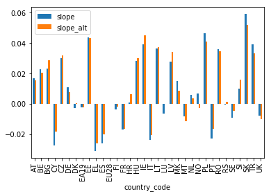
Okay, now I can see something!
A few refinements
However, the y axis is not labeled yet. I can fix this with the matplotlib ylabel() method.
Also, I multiply the slope values by 100 (using the pandas mul() method) to get the percentage change of the production index per year:
df[['slope','slope_alt']].mul(100).plot(kind='bar')
plt.ylabel('Annual growth rate (%), relative to EU28')
plt.show()
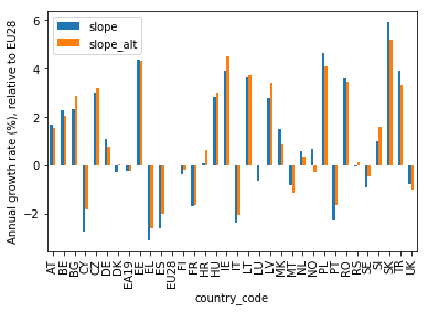
Better!
Ordering the countries by slope value
Note, though, that the slope values keep changing wildly, giving the plot a somewhat chaotic look. This is because the country codes on the x axis are in alphabetical order. The plot would look much cleaner if the country codes were ordered by the slope values instead.
This I can do by chaining the sort_values() method to the dataframe selection before calling the plot(). I tell pandas to sort by the slope column using the by keyword and to do so in descending order by setting ascending=False. In addition, I set a title for the plot:
ax = df[['slope','slope_alt']].mul(100).sort_values(by=['slope'], ascending=False).plot(kind='bar')
plt.xlabel('Country code')
plt.ylabel('Annual growth rate (%), relative to EU28')
plt.title('Manufacturing growth dynamics in Europe, 2000-2017')
plt.show()
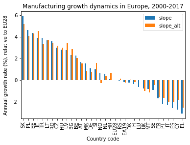
In this shape, the plot is clean enough to allow for an easy visual analysis of the data. This will be the topic of the subsequent project.
Conclusion
I have visualized the manufacturing growth dynamics of European countries in the years 2000–2017 with bar charts, using the plotting method of pandas, which builds on matplotlib.
The combination of pandas method chaining and matplotlib commands allows the creation of customized plots with just a few lines of code.
Code
The project code was written using Jupyter Notebook 5.0.0, running the Python 3.6.3 kernel and Anaconda 5.0.1.
The Jupyter notebook can be found on Github.
Bio
I am a data scientist with a background in solar physics, with a long experience of turning complex data into valuable insights. Originally coming from Matlab, I now use the Python stack to solve problems.
Contact details
Jan Langfellner
contact@jan-langfellner.de
linkedin.com/in/jan-langfellner/
One thought on “Different countries’ growth dynamics at a glance with bar charts”