TL;DR
I use the visualization of the EU countries’ manufacturing growth rate with a pandas/matplotlib bar chart to show that the performance mostly depends on geographical position: the East beats the South.
Long Description
In the previous project, I plotted the growth dynamics of the EU countries’ industry production manufacturing branch, measured as a constant slope from linear regression and an alternate slope from the difference end minus beginning of the time series, in a bar chart. A comparison of the two slope measures shows that values are robust enough to allow for a distinction between different groups of countries.
It turns out that the best-performing countries are mostly located in Eastern Europe, whereas the worst-performing countries are in the South. I highlight this result by color-coding the bars by region.
Table of contents
Project Background
Now that I have distilled a growth indicator from the EU manufacturing industry production index dataset and visualized it in a bar chart, I can use the plot to extract information and finally draw conclusions. Here is the figure from the previous project:
import pandas as pd
import matplotlib.pyplot as plt

# Reading in the dataframe
df = pd.read_pickle('EU_industry_production_slopes.pkl')

# Creating the bar chart
ax = df[['slope','slope_alt']].mul(100).sort_values(by=['slope'], ascending=False).plot(kind='bar')
plt.xlabel('Country code')
plt.ylabel('Annual growth rate (%), relative to EU28')
plt.title('Manufacturing growth dynamics in Europe, 2000-2017')
plt.show()
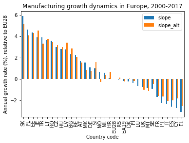
Before taking a closer look at the individual countries’ performance and their relationship, I check if the slope values that I obtained are precise enough for a meaningful interpretation.
Does the data make sense?
Sanity check: slope of EU28
One thing to keep in mind is that I normalized the original industry production indices by dividing each country’s time series point-wise by the EU28 average. This means that the slope does not show the full growth rate in the covered period (2000–2017), but the growth rate relative to the EU average growth rate.
In other words: Countries with negative slopes had their manufacturing industry sector growing more slowly than the EU average, and countries with positive slopes faster than average.
A good sanity check is to make sure that the slope measured for the EU28 is actually zero. A quick look at the bar chart shows that this is indeed the case, for both slope measures!
Robustness test: comparing the two slopes
Another question is how well the growth rate is captured by the linear model. I can get a rough estimate by comparing this slope (slope) with the alternate slope (slope_alt) that I obtained as the simple difference of the production indices between the beginning and the end of the time series, divided by the period of 17 years.
From the bar chart I can see that the difference between the two slope values is always smaller than one percent, mostly even smaller than half a percent. This is small compared to the total span of the slope values, ranging from about plus six to minus three percent.
This means that the countries’ position in the chart compared to their closest neighbors is rather random, whereas the rough area they are in is not.
Visible trends
It’s the geography
When thinking about what neighbors in the bar chart have in common, there is one apparent answer: Geography!
Out of the eleven fastest-growing countries, nine are in the Eastern part of the EU (the exceptions being Ireland, IE, and Turkey, TR). At the other end, the five (six, if counting France, FR, as well) slowest growing / fastest shrinking countries are located in Southern Europe.
This means that Eastern Europe has been catching up, while Southern Europe has been falling behind in terms of manufacturing volume. Northern and central European countries are mostly in between.
Note that this geographical information has not been a part of the dataset, so the interpretation relies on domain knowledge.
Automatically identifying groups
Without this information, it would also have been possible to identify groups in the bar chart based solely on the slope values. While this is trivial in this case where I can plot the data easily (apart from the problem of defining how many groups there are in total and drawing clear lines between them), more complex datasets would require using more sophisticated tools like clustering algorithms.
Visualizing the groups
Let’s now color-code the bars by region.
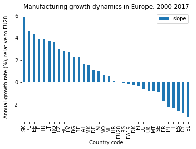
Dropping the alternate slope
First, I remove the alternate slope from the bar chart:
# Store modified slope column from df in new dataframe:
df_sorted_slopes = df[['slope']].mul(100).sort_values(by=['slope'], ascending=False)

# Create plot:
ax = df_sorted_slopes.plot(kind='bar')
plt.xlabel('Country code')
plt.ylabel('Annual growth rate (%), relative to EU28')
plt.title('Manufacturing growth dynamics in Europe, 2000-2017')
plt.show()
Assigning each country a region
Next, I associate each country code with a European region, using the broad geographical categories “West”, “East”, “North”, “South”, “Center”. Additional labels are “Non-EU” for non-EU countries and “Average” for the “EU28” and “EA19” averages.
I store the country_code/region pairs in a dictionary and turn it into a pandas series:
# Associate country codes with European regions:
region_dict = {'AT': 'Center', 'BE': 'Center', 'BG': 'East', 'CY': 'South', 'CZ': 'East', 'DE': 'Center', 'DK': 'North', 'EA19': 'Average', 'EE': 'East', 'EL': 'South', 'ES': 'South',
       'EU28': 'Average', 'FI': 'North', 'FR': 'West', 'HR': 'South', 'HU': 'East', 'IE': 'West', 'IT': 'South', 'LT': 'East', 'LU': 'Center', 'LV': 'East', 'MK': 'Non-EU',
       'MT': 'South', 'NL': 'Center', 'NO': 'Non-EU', 'PL': 'East', 'PT': 'South', 'RO': 'East', 'RS': 'Non-EU', 'SE': 'North', 'SI': 'South', 'SK': 'East', 'TR': 'Non-EU', 'UK': 'West'}

# Create pandas series from dictionary:
region_series = pd.Series(region_dict)
print(region_series)
AT       Center
BE       Center
BG         East
CY        South
CZ         East
DE       Center
DK        North
EA19    Average
EE         East
EL        South
ES        South
EU28    Average
FI        North
FR         West
HR        South
HU         East
IE         West
IT        South
LT         East
LU       Center
LV         East
MK       Non-EU
MT        South
NL       Center
NO       Non-EU
PL         East
PT        South
RO         East
RS       Non-EU
SE        North
SI        South
SK         East
TR       Non-EU
UK         West
dtype: object
The series can be easily added as a column to the dataframe:
df_sorted_slopes['region'] = region_series
print(df_sorted_slopes.head())
                 slope  region
country_code
SK            5.912756    East
PL            4.644023    East
EE            4.363604    East
IE            3.928391    West
TR            3.898301  Non-EU
Assigning each region a color
As the next step, I associate colors with the different regions, again with a dictionary:
# Create color dictionary:
color_dict = {'West':'tab:blue', 'East':'tab:red', 'North':'xkcd:warm purple', 'South':'xkcd:toxic green', 'Center':'xkcd:macaroni and cheese', 'Non-EU':'tab:gray', 'Average':'k'}

# Map colors to countries:
colors = list(df_sorted_slopes['region'].map(color_dict))
print(colors)
['tab:red', 'tab:red', 'tab:red', 'tab:blue', 'tab:gray', 'tab:red', 'tab:red', 'tab:red', 'tab:red', 'tab:red', 'tab:red', 'xkcd:macaroni and cheese', 'xkcd:macaroni and cheese', 'tab:gray', 'xkcd:macaroni and cheese', 'xkcd:toxic green', 'tab:gray', 'xkcd:macaroni and cheese', 'xkcd:toxic green', 'k', 'tab:gray', 'k', 'xkcd:warm purple', 'xkcd:warm purple', 'xkcd:macaroni and cheese', 'tab:blue', 'xkcd:toxic green', 'xkcd:warm purple', 'tab:blue', 'xkcd:toxic green', 'xkcd:toxic green', 'xkcd:toxic green', 'xkcd:toxic green', 'xkcd:toxic green']
The “tab” colors are taken from the standard categorical color palette, the “xkcd” colors come from the xkcd color survey, and “k” stands for black.
Drawing the plot
Now I can produce the plot, where I pass the colors list to the color argument of the pandas plot() method. I also add a legend that relates the colors to regions. The custom legend is built with the matplotlib Patch object and a list comprehension that iterates over the color dictionary:
import matplotlib.patches as mpatches

# Define basic plot:
ax = df_sorted_slopes['slope'].plot(kind='bar', color=colors)
plt.xlabel('Country code')
plt.ylabel('Annual growth rate (%), relative to EU28')
plt.title('Manufacturing growth dynamics in Europe, 2000-2017')

# Define custom legend from color_dict:
patch_list = [mpatches.Patch(color=value, label=key) for key,value in color_dict.items()]
plt.legend(handles=patch_list, title='Region')

# Draw plot:
plt.show()
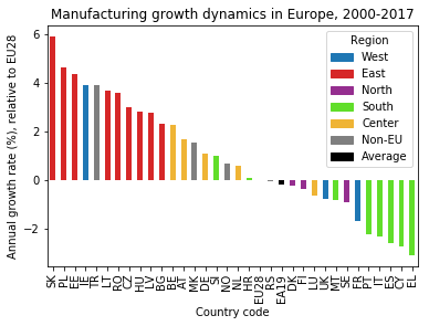
The trend that Eastern European countries have been catching up and Southern European have been falling behind is directly visible now!
Note: There was a bug in pandas version 0.20.3 that caused only the first color to be used in the plot instead of the full palette. A manual update to 0.21.0 fixed this problem.
Conclusion
The growth rates of the manufacturing industry for the European countries that I calculated with linear regression are robust enough to extract general trends from the data: Whereas central and Northern European countries show growth rates that are inconspicuous, the industry production index in manufacturing for Eastern European countries has been growing outstandingly fast and for Southern European countries remarkably slow.
This message could be emphasized by color-coding the region each country belongs to in the bar chart (after working around a pandas bug).
Code
The project code was written using Jupyter Notebook 5.0.0, running the Python 3.6.3 kernel and a modified version of Anaconda 5.0.1 (with pandas 0.21.0).
The Jupyter notebook can be found on Github.
Bio
I am a data scientist with a background in solar physics, with a long experience of turning complex data into valuable insights. Originally coming from Matlab, I now use the Python stack to solve problems.
Contact details
Jan Langfellner
contact@jan-langfellner.de
linkedin.com/in/jan-langfellner/