TL;DR
I use statistical and graphical tools to perform exploratory data analysis (EDA) on the EU industry production dataset as a starting point for modeling the time series.
Long Description
With the help of the pandas describe method and the matplotlib package I explore the statistics of the EU industry production dataset, more precisely the manufacturing data subset that I previously extracted from a PostgreSQL data store.
The describe method yields statistical information like the mean and median. They have values that are close to 100, which is the reference value for the production index in 2010. A histogram plot shows the entire distribution of the production index values and reveals a second peak at very low values (about 10). A line plot of these values makes it clear that these data points are real and constitute the earliest available values for Ireland in the 1980s. For the other countries, the time series start later, and complete data for most countries are only available for 2000–2017.
A joint line plot for this period shows two main features: a sudden drop of the production index values in 2008 that is similar for most countries and a long-term trend that describes a steady increase or decrease individually for each country.
The results demonstrate how much information can be extracted from data with basic methods. This exploratory data analysis is a basis for further analysis and modeling.
Table of contents
Project Background
Exploratory data analysis (EDA) uses different statistics and visualization techniques to provide basic insights into the (clean) data at hand: How are its values distributed? Are there any suspicious values, e.g. outliers? Are there any visible trends or obvious groups in the data?
This can help formulate deeper questions about the data and lead to hypotheses and models that may be tested.
Here I continue with the cleaned EU manufacturing industry production dataframe from the previous project.
Production index value distribution
To get started, let’s have a look at the dataframe structure:
df.info()
print(df.head())
<class 'pandas.core.frame.DataFrame'>
MultiIndex: 27936 entries, (1953-01-01 00:00:00, AT) to (2017-08-01 00:00:00, UK)
Data columns (total 2 columns):
production_index    8744 non-null float64
flags               27936 non-null category
dtypes: category(1), float64(1)
memory usage: 333.9+ KB

                         production_index flags
time       country_code
1953-01-01 AT                         NaN
           BA                         NaN
           BE                         NaN
           BG                         NaN
           CY                         NaN
The dataframe has only 8744 non-null production index values, which is only a third of all entries.
The describe method
Let’s see how these values are distributed. A quick overview can be gained using the Pandas describe() method:
print(df.describe())
       production_index
count       8744.000000
mean          97.614010
std           21.815713
min            9.900000
25%           89.900000
50%          100.600000
75%          109.900000
max          190.500000
For all numeric columns (there is just one in this dataframe), I get basic statistics like the mean, the median (“50%” — the 50th percentile, i.e. 50% of all values are larger and the other 50% of the values are smaller than the median), the standard deviation (“std”) as a measure for the spread of the values, or minimum/maximum values.
Both the median and the mean are suspiciously close to 100, which is the value that was assigned to the production index for the reference year 2010, according to the documentation (Section 3.9). Either the industry production has been stagnating for a long time, or the missing values are clustered at earlier decades.
Also the minimum value, “9.9”, is quite small. This could be real (for example for a country that developed quickly and for which the data reach back a long time), but also indicating bad data.
Histogram plot
Let’s take a closer look at the distribution with a histogram plot. This can be done directly in pandas with the hist() method, building on the matplotlib package:
import matplotlib.pyplot as plt  # Import Python plotting package
df.hist(bins=50)  # Define the histogram, use 50 bins
plt.show()        # Draw the figure
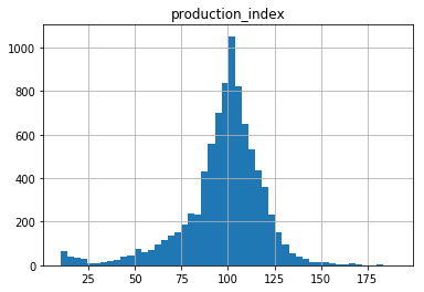
The distribution is peaked at about 100, but is quickly falling off to the flanks (compared to a Gaussian distribution) and is asymmetric.
Outliers: bad values or real data?
Interestingly, the minimum value seems to belong to a small distribution disjoint from the main distribution of the production index values. The cut-off between the two is at about 25.
Do the small values have something in common? Do they belong only to certain countries? Do they appear at the beginning of the time series? Let’s find out!
Selecting the outliers
First, I construct a new dataframe that only contains the rows with the low production index values beneath the threshold of 25. This I can accomplish using a Boolean mask:
df_low = df[df['production_index']<=25].sort_index()
df_low.info()
print(df_low.head())
print(df_low.tail())
<class 'pandas.core.frame.DataFrame'>
MultiIndex: 169 entries, (1980-01-01 00:00:00, IE) to (1994-01-01 00:00:00, IE)
Data columns (total 2 columns):
production_index    169 non-null float64
flags               169 non-null category
dtypes: category(1), float64(1)
memory usage: 8.5+ KB

                         production_index flags
time       country_code
1980-01-01 IE                        11.0
1980-02-01 IE                        10.4
1980-03-01 IE                        10.5
1980-04-01 IE                        10.7
1980-05-01 IE                        10.6

                         production_index flags
time       country_code
1993-09-01 IE                        24.1
1993-10-01 IE                        24.0
1993-11-01 IE                        24.0
1993-12-01 IE                        24.9
1994-01-01 IE                        24.7
Hmm, does this mean that there is only one country index — ‘IE’, for Ireland? I can access the country_code level of the MultiIndex values and find all distinct ones with the unique() method, like this:
print(df_low.index.get_level_values('country_code').unique())
Index(['IE'], dtype='object', name='country_code')
Plotting the outliers
These extreme values do indeed all belong to Ireland! Let’s plot the development of the Irish industry production index for the whole data period:
df.loc[(slice(None),'IE'),:].plot()  # Select Ireland and define line plot
plt.show()                           # Draw the figure
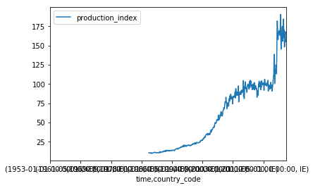
The x axis looks horrible and needs to be fixed to be able to see something. The problem is that the whole MultiIndex ('time','country_code') is used for the x axis.
However, I only want the time to be on the x axis. This can be done by first making the country_code index part an ordinary column, using the unstack(level=1) command (where level 0 is the first part, 'time', of the index and level 1 the second part, 'country_code'), before applying the plot() method.
I also make it clear to pandas that production_index should be the y axis by passing this column name to the plot() method:
df.loc[(slice(None),'IE'),:].unstack(level=1).plot(y='production_index')
plt.show()
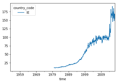
This looks much better! However, I should label the axes correctly:
df.loc[(slice(None),'IE'),:].unstack(level=1).plot(y='production_index')
plt.xlabel('Year')
plt.ylabel('Production index')
plt.show()
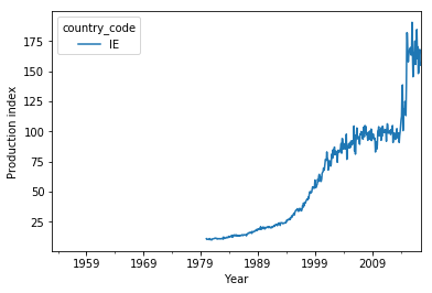
So the low manufacturing production index values are no outliers due to bad data but reflect the enormous growth of the Irish economy in the recent decades. I can also see that there is no data before 1980 — that is almost half the data period!
Where are the missing values?
That brings me back to the question if the missing values are in general clustered at the beginning of the dataset. I count the number of missing values for each time step, store the result in a dataseries, divide by the 36 country_code values and plot the percentage:
import numpy as np
missing = df['production_index'].isnull().groupby('time').sum()  # Count missing values (NaN) for each month
missing_percent = missing/36*100                                 # Convert into percent values (there are 36 country_code values)
missing_percent.plot()                                           # Plot command
plt.xlabel('Year')                                               # Fix labels
plt.ylabel('Missing values per month [percent]')
plt.show()                                                       # Draw figure
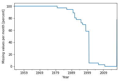
There is no data at all before 1980! Apparently, Ireland is the country for which the data reaches back the longest. About half of the countries kick in over the course of the next 20 years, and most of the other half only in 2000.
This means that for a comparison between the different countries, I am confined to the period 2000–2017 when using this dataset.
A synopic view
All the countries at once
For a quick overview, let me plot all curves on top of each other for the period 2000–2017 (where both years are inclusive):
df.loc[(slice('2000','2017'),slice(None)),:].unstack(level=1).plot(y='production_index')
plt.xlabel('Year')
plt.ylabel('Production index')
plt.show()
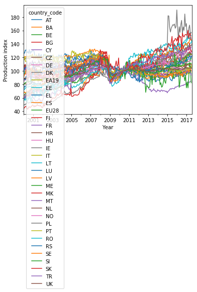
Well, this plot looks ugly with such a long legend. Also, the line colors cycle through only 10 values before repeating. This makes it impossible to unambiguously relate the entries in the legend to the lines.
Let me clean the plot up a bit. I use 36 colors spanning the entire nipy_spectral colormap and cycle twelve times through three different linestyles (solid, dashed, dotted) to make the curves distinguishable. The lists of color values and linestyles are passed as keyword arguments to the set_prop_cycle() method of the axes object ax before the plot() method is executed:
fig, ax = plt.subplots()        # Create figure and axes objects

# Reset line properties to avoid ambiguity between different lines:
ax.set_prop_cycle(color=plt.cm.nipy_spectral(np.linspace(0,1,36)),linestyle=['-','--',':']*12)

# Create the plot:
ax = df.loc[(slice('2000','2017'),slice(None)),:].unstack(level=1).plot(y='production_index',ax=ax)
plt.xlabel('Year')
plt.ylabel('Production index')
ax.legend(ncol=6, fontsize=7)   # Adjust shape (four columns instead of one) and font size of legend
plt.show()
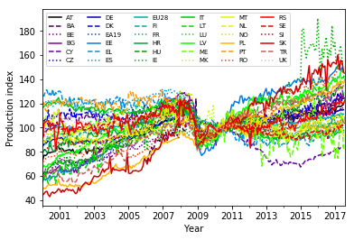
This plot is still a bit of overkill with 36 lines, but it provides a synoptic view for the EU manufacturing production index development in the given period.
Apparently, there is a wide range of dynamics covered by the different countries in the last 17 years — reaching from a strong increase of the index (for Slovakia) to a slight decline (Finland) and basically anything in between. Note that the curves meet in 2010 at the value 100, since this is how they were normalized.
EU average
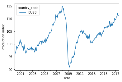
Most curves show a sudden drop in 2008, in the wake of the financial crisis. This can be seen better in the average over the European Union, the ‘EU28’:
<code class="language-python">
ax = df.loc[(slice('2000','2017'),'EU28'),:].unstack(level=1).plot(y='production_index')
plt.xlabel('Year')
plt.ylabel('Production index')
plt.show()
Towards a model
The time series for the different countries thus share some properties, but also show differences. An interesting question is how well the countries have performed and if there are any patterns in the performance results, e.g. a dependence on the region.
To answer this question and facilitate a comparison, it is useful to reduce the complexity of the time series to single numbers that sum up the properties of the production index development. This will be the topic of the next project.
Conclusion
I have explored the EU industry production index values using the pandas describe method and produced a histogram plot with matplotlib. The distribution of the production index values peaks near 100 (the reference value) and shows a second peak at the lower end of the distribution. A closer look revealed that these small values are real and belong to Ireland. Two thirds of the dataframe entries are missing values, which are clustered in the first half of the period covered by the time index, before the actual (continuous) time series for each country start. Complete coverage for most countries is restricted to the period 2000–2017.
The effect of the financial crisis in 2008 on the industry production can be seen as a sudden drop of the index values for most countries. Apart from this, each country shows an individual long-term increase/decrease of the index values.
Creating meaningful plots directly using pandas methods required some manual rearrangements of the dataframe. Especially the MultiIndex complicates the plotting. The tidy dataframe structure may actually have some downsides for this purpose (at least with the current pandas version).
Code
The project code was written using Jupyter Notebook 5.0.0, running the Python 3.6.2 kernel and Anaconda 5.0.
The Jupyter notebook can be found on Github.
Bio
I am a data scientist with a background in solar physics, with a long experience of turning complex data into valuable insights. Originally coming from Matlab, I now use the Python stack to solve problems.
Contact details
Jan Langfellner
contact@jan-langfellner.de
linkedin.com/in/jan-langfellner/
One thought on “Exploring the industry production history with EDA”