TL;DR
I divide the EU industry production index time series for each country by the smoothed EU average time series to bring out the countries’ individual development for further modeling.
Long Description
Using a chain of pandas methods to obtain a rolling-mean average, I smooth the EU average time series of the industry production index. This curve contains the development that the different countries have in common. Dividing the time series for each country element-wise by the EU-average curve thus removes this common part. The remaining normalized production index reflects the countries’ individual development compared with the EU average and is the basis for the growth modeling in the next project.
Project Background
From the exploratory data analysis that I performed on the EU industry production data in the previous project, I know that the time series for the different countries show different long-term trends (increasing or decreasing production index) but also conspicuous parallel features such as a sudden drop and recovery in the years 2008–2011.
As I would like to compare the countries’ performance, I want to (i) remove these common trends to distill their individual devolopment and (ii) then use some simple model to extract some quantity from the time series that can serve as a measure for the countries’ performance.
In this project, I normalize the individual time series by the EU average to achieve goal (i). The next project will then deal with goal (ii).
Recap
Reading in the data
As before, I read in the tidy dataframe with clean values from a pickled file, using the read_pickle() method and show its structure:
import pandas as pd
df = pd.read_pickle('EU_industry_production_dataframe_clean.pkl')
df.info()
print(df.head())
<class 'pandas.core.frame.DataFrame'>
MultiIndex: 27936 entries, (1953-01-01 00:00:00, AT) to (2017-08-01 00:00:00, UK)
Data columns (total 2 columns):
production_index    8744 non-null float64
flags               27936 non-null category
dtypes: category(1), float64(1)
memory usage: 333.9+ KB

                         production_index flags
time       country_code
1953-01-01 AT                         NaN
           BA                         NaN
           BE                         NaN
           BG                         NaN
           CY                         NaN
Data visualization
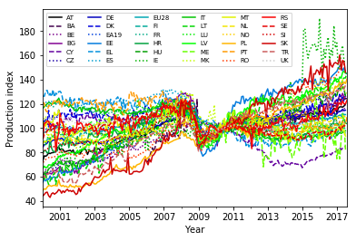
From the exploratory data analysis that I did in the previous project I know that the individual countries showed a sudden drop in the production index values in 2008. Here is how I plotted the curves for all the countries:
import matplotlib.pyplot as plt
import numpy as np

# Select data for years 2000-2017 and store it in a new dataframe:
df_late = df.loc[(slice('2000','2017'),slice(None)),:].copy()   # Note: the copy() is needed to avoid getting a view

# Create figure and axes objects:
fig, ax = plt.subplots()

# Reset line properties to avoid ambiguity between different lines:
ax.set_prop_cycle(color=plt.cm.nipy_spectral(np.linspace(0,1,36)),linestyle=['-','--',':']*12)

# Create the plot:
ax = df_late.unstack(level=1).plot(y='production_index',ax=ax)
plt.xlabel('Year')
plt.ylabel('Production index')
ax.legend(ncol=6, fontsize=7)   # Adjust shape (four columns instead of one) and font size of legend
plt.show()
The drop is clearest in the average over all 28 EU countries:
eu_avg_late = df_late.loc[(slice(None),'EU28'),:].unstack(level=1)  # Select EU average for years 2000-2017

ax = eu_avg_late.plot(y='production_index')  # Plot
plt.xlabel('Year')
plt.ylabel('Production index')
plt.show()
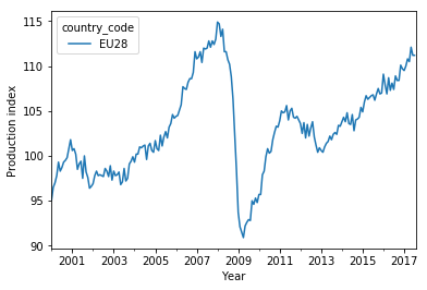
In addition to the drop and recovery, there is a moderate long-term increase of the production index.
This curve can be used to normalize the time series for each country, to bring out the individual performance, i.e. if a country has developed faster or slower than the EU average.
Smoothing the average curve
Rolling mean for the selected years…
Before appying the normalization, I first smooth the EU average to get rid of the short-time fluctuations. There are different ways to accomplish this (e.g., Savitzky-Golay filters), with different side effects. Here, I just want a rough correction and use a simple rolling mean over five consecutive time steps (five months):
eu_avg_late_smooth = eu_avg_late.rolling(window=5).mean()  # Smooth EU average

ax = eu_avg_late_smooth.plot(y='production_index')  # Plot
plt.xlabel('Year')
plt.ylabel('Production index')
plt.show()
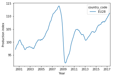
This curve is smoother indeed. Note, however, that I lose four data points at the beginning (January 2000 through April 2000) because the rolling mean of five points needs the current point plus the previous four data points to output a value.
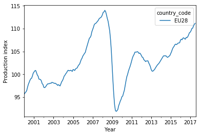
…and for all the years
To prevent this from happening, I first apply the rolling mean on the full time series first and only then select the period 2000–2017:
eu_avg = df.loc[(slice(None),'EU28'),:].unstack(level=1)  # Select EU average for all years (1953-2017)
eu_avg_smooth = eu_avg.rolling(window=5).mean()           # Smooth EU average
eu_avg_late_smooth_corrected = eu_avg_smooth.loc[slice('2000','2017'),:]  # Restrict to years 2000-2017

ax = eu_avg_late_smooth_corrected.plot(y='production_index')  # Plot
plt.xlabel('Year')
plt.ylabel('Production index')
plt.show()
Normalizing the time series
Dividing by the EU average
Now I take the smoothed curve and divide each time series in df_late by it, element-wise. This is done with the pandas div() method. Before applying it, I select the production_index (since I cannot sensibly divide the flag strings by numbers) and unstack the country_code from the MultiIndex (turn each country into its own column).
In the resulting pandas series, I stack up the country_code values in the index again to have the same structure as in the original dataframe:
eu_avg_late_smooth_corrected_series = eu_avg_late_smooth_corrected['production_index','EU28']  # Select pandas series

# Unstack country_code, divide each column by smoothed series, stack country_code again:
production_index_norm_series = df_late['production_index'].unstack(level=1).div(eu_avg_late_smooth_corrected_series,axis=0).stack()
print(production_index_norm_series.head())
time        country_code
2000-01-01  AT              0.763119
            BE              0.659628
            BG              0.638720
            CY              1.076730
            CZ              0.609450
dtype: float64
This series contains the ratio of a country’s production index and the EU average production index, so it is easy to see how well a country has performed compared to others in the given period.
A glimpse on the normalized time series
Let’s plot the curves and see if the dip after the start of the financial crisis is gone:
fig, ax = plt.subplots()        # Create figure and axes objects

# Reset line properties to avoid ambiguity between different lines:
ax.set_prop_cycle(color=plt.cm.nipy_spectral(np.linspace(0,1,36)),linestyle=['-','--',':']*12)

# Create the plot:
ax = production_index_norm_series.unstack(level=1).plot(ax=ax)
plt.xlabel('Year')
plt.ylabel('Production index [relative to EU28 avg.]')
ax.legend(ncol=6, fontsize=7)   # Adjust shape (four columns instead of one) and font size of legend
plt.show()
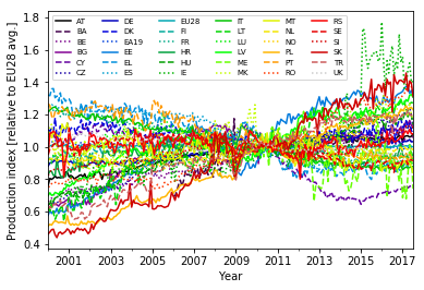
The correction is far from perfect, but removes the biggest part of the dip in the years 2008–2011.
Store the normalized time series in the dataframe
I integrate the normalized industry production values into the dataframe:
df_late.loc[:,'production_index_norm'] = production_index_norm_series
print(df_late.info())
print(df_late.head())
<class 'pandas.core.frame.DataFrame'>
MultiIndex: 7632 entries, (2000-01-01 00:00:00, AT) to (2017-08-01 00:00:00, UK)
Data columns (total 3 columns):
production_index         7412 non-null float64
flags                    7632 non-null category
production_index_norm    7404 non-null float64
dtypes: category(1), float64(2)
memory usage: 156.8+ KB
None

                         production_index flags  production_index_norm
time       country_code
2000-01-01 AT                        73.0                     0.763119
           BA                         NaN                          NaN
           BE                        63.1                     0.659628
           BG                        61.1                     0.638720
           CY                       103.0                     1.076730
The normalized time series are now ready to be used for modeling.
For using the dataframe in the next project, I store it on disk as a pickled file:
df_late.to_pickle('EU_industry_production_dataframe_normalized_2000-2017.pkl')
Conclusion
I have smoothed the EU-average production index time series using a rolling-mean average and divided the time series for each country by this smooth average curve. This processing has mostly removed the common features of all the time series, in particular the drop and subsequent rise of the index in the wake of the financial crisis in 2008. The resulting normalized production index time series shows the individual development of the production index for each country with respect to the common development.
They can thus be used as a starting point for modeling the growth dynamics of the production index for each country.
In this project, I had to pay closer attention to whether pandas creates a view or a copy of a dataframe selection when I attempted to assign values to the dataframe. Especially the distinction between chaining (df['a']['b']) and locator-based access (df.loc['b','a']) is important: Chaining might create either a view or a copy (depending on arcane implementation details of pandas), whereas loc will create a view. So the latter should be used for the assignment. If the first option is used instead, pandas issues a warning (SettingWithCopyWarning, see pandas documentation) because it might be that not the original dataframe is altered, but a copy that has no reference.
Code
The project code was written using Jupyter Notebook 5.0.0, running the Python 3.6.3 kernel and Anaconda 5.0.1.
The Jupyter notebook can be found on Github.
Bio
I am a data scientist with a background in solar physics, with a long experience of turning complex data into valuable insights. Originally coming from Matlab, I now use the Python stack to solve problems.
Contact details
Jan Langfellner
contact@jan-langfellner.de
linkedin.com/in/jan-langfellner/
2 thoughts on “Removing common trends from a set of time series to highlight their differences”